
Technical DetailsNotes, thoughts, and suggestions for making an illustration-intensive book, based on my experience with Carfree Cities. This information is provided without any warranty. DTPCarfree Cities was typeset in Adobe FrameMaker 5.5.3 running under Windows 95, OSR 1 on a Pentium 200 MMX with 96 MB of RAM.FrameMaker is exceptionally stable and tightly written, so it runs fast even on relatively slow computers. This program has a number of irritating mistakes in the user interface and is limited in its usefulness for purposes other than that for which it was designed: making books. For this purpose, it is, in my opinion, clearly the best tool now available. If Corel ever fixes the problems with Ventura that caused me to abandon it after countless versions and much wasted time, Ventura will be a more powerful and easier-to-use package. However, I was never able to stop Ventura from occasionally moving a marginal note from its assigned place to the end of a chapter. This was the sole reason that I replaced it with FrameMaker. Corel technical support was unable to suggest a reasonable solution. FontsThe book is set using only two fonts: Monotype Bembo and Helvetica Light. The Bembo Expert Set was used to supply real small capitals. The width table for Bembo contains what are, to my eye, clear errors. Just before press time, I was able to hand-kern the font by editing the AFM to increase the spacing between about 20 kerning pairs. Unlike the PFM, the AFM is human-readable, and Adobe Type Manger creates a new PFM on the fly when the font is reinstalled. I think Bembo is the most beautiful typeface ever cut, and also arguably the most readable. It was worth the struggle to get it to set correctly. I've suggested to Adobe that this font is worthy of a two-axis Multiple Master font (optical size and weight).PostScriptI did not realize just how important the PostScript driver is to typesetting until it was nearly too late. In the end, the book was set using the Windows PostScript driver version 4.1.1. The PPD also appears to be of great importance, and some of the font spacing errors I had been seeing disappeared when I replaced the PPD for the Lexmark Optra R printer with one for a Linotronic 530. Quite a number of inexplicable problems disappeared as soon as the change was made. If you know who will be outputting your job, find out what driver version and PPD they are using, and use the same one. Newer versions appear to be more problematic than the version 4.1.1 that I used.DrawingsNearly all of the drawings in Carfree Cities were created in Adobe Illustrator 8 (a very few were created in Photoshop). Most of the actual work was done by Arin Verner. I find it an exceptionally difficult program to use. While this sort of tool is intrinsically complex and hard to learn, Illustrator has so many peculiar traits and bugs that the process is made unreasonably difficult. I will not use Illustrator for a future book, unless Adobe releases a radically improved version. (Which leaves the question of what I might use open to discussion. Does anyone have good experience with a vector-based drawing program?) |
PhotographsAll of the photographs in Carfree Cities were processed through Adobe Photoshop. Most of the work was done in version 5, but 4 was used in the beginning. Happily, I can report that this is a far superior piece of software design and construction than Illustrator. There are still a number of irritations, but the program was clearly designed with expert users in mind. Taking the time to learn Photoshop will be well rewarded. It is powerful and quite fast (given the enormous amount of processing required by many operations). It wants lots of memory: I found 96 MB to be insufficient, and 256 MB to be ample.The process was as follows: Acquire ImageMost of the photographs were taken with a pair of Nikon F3HP cameras and a variety of Nikkor wide-angles. I also used a 30-year-old Nikon F for a few images. Richard Risemberg took quite a few photographs of Los Angeles for me, using an Olympus digital camera, with quite satisfactory technical results. Others also contributed images taken with both silver and digital cameras. I found Kodak Ektachrome 200 to be the most suitable film for this work, although it is always troublesome with high-contrast images. Unfortunately, color negative films have such high base densities that conventional scanning techniques are unable to retrieve all of the highlight detail that the film is capable of capturing. (This problem may be reduced with larger film formats, as I believe that reduced base densities are characteristic of these films.) Drum scans can retrieve practically anything that is on film, but the cost is high.Digitize ImageNearly all of the images taken with film-based cameras were scanned onto Kodak Pro-PhotoCDs. (A few drum scans were also made). This is quite a good system and reasonably inexpensive. The quality of the result is highly dependent on the skill of the operator - this is not a good place to try to save money. I learned to ask them not to electronically de-dust the images - this is better done in Photoshop. (If the film was carefully processed and cleaned before scanning, dust is not usually much of a problem.) The image resolution is quite high and sufficient for most purposes. (There is also a "6-pack" that provides even higher resolution, but I did not find this necessary.)Import into PhotoshopThe PhotoCD images were imported directly into Photoshop. The only tricks here are to import the right size (always at least 300 DPI at final printed size) and to use the right color correction profile. Ask your scanning service to provide this on the CD.RetouchVirtually all images will need some form of retouching, if only to remove dust. The PhotoCD images have rounded corners, and it is necessary to fill these out if the full image is to be used (which, in the case of Carfree Cities, was nearly always the case). Retouching was otherwise fairly slight, except for a handful of images.Crop, Size & ScaleIf images are to be cropped, this should be done before sizing. The images should then be set to their final printed size. I find it better not to resample images. Modern high-resolution rippers (what the printer uses to make film or plates) are fast enough that images that are somewhat oversize do not present much of a problem. If you do resize, I suggest loading the image at a resolution at least twice as high as the desired final result, and then downsampling. I believe that this results in the least quality loss.Adjust & CorrectAlways use control layers when this is possible. This allows access to the original data at any time. Repeated direct adjustment of the image will result in a jagged histogram and an image that prints poorly.I used the Auto function in a curve layer, with the end points set to 0%. This preserves the full dynamic range of the image. (Be sure to crop out or fill any non-image area before applying the Auto function - it will otherwise assume that non-image data is within the dynamic range of the image, leading sometimes to highly inaccurate results.) I then assessed the results visually and using the histogram. (Images were viewed on a Vision Master Pro17 with a Diamondtron CRT. This is by far the best low-cost monitor I have ever seen, and is in some ways superior to monitors costing far more.) In many cases, I moved the end points of the curve inward, trimming off just a little bit of data in the deepest shadows and brightest highlights. This increases the overall contrast of the image. Finally, in about 25% of the cases, I made subtle changes to the shape of the correction curve, to improve the tonal characteristics of the image. Large changes are to be avoided - any image that isn't good enough without this kind of radical surgery probably isn't good enough to print. Final ProcessingI used the Actions function of Photoshop to assure that all images were correctly processed to the final grayscale TIFFs. The Actions feature in Photoshop is very frustrating, difficult to learn, difficult to use, and sometimes does unexpected things that may even endanger your data. Back up your data, be patient, read the manual, and in the end you'll not regret using Actions if you have a large number of images to deal with.The sequence of final processing was:
Press CorrectionsThe printing press remains an imperfect device despite radical improvements in recent years. (The move to direct-to-plate output has eliminated the quality losses that once were caused by the use of intermediate film.) You will have to control the minimum and maximum size of your halftone dots, based on data provided by your printer. (The information will be provided as percentages of black ink, which you will need to convert to Hex for Photoshop.) Also, the value of the midtones must be raised, typically by about 10%, in order to control for the increase in dot size on press. By using Photoshop Actions, you can make a single correction layer that will be applied to all images, assuring consistency.
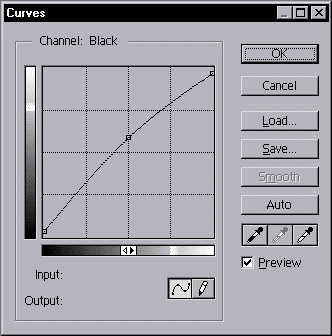
The curve above is the one used in Carfree Cities. The shadows were trimmed to a value of 8, the highlights to a value of 247, and the midtone value increased from 128 to 150. SharpeningNote that sharpening was performed AFTER press correction. This results in values that exceed the limits of the press, but because these values only occur at edges, they do not result in large areas of solid black or white, which must be avoided. I would not dare use this approach except when printing on good paper and when the press is in excellent condition, fully calibrated, and operated by a true professional. Otherwise, you had better sharpen your images before applying the press corrections. Always check your images using a Threshold layer to assure that no large areas of the image exceed the values that can be reproduced on press.Sharpening is one area where art and experience are required. The following is the approximate range of values that were applied using Unsharp Mask to the photographs in Carfree Cities:
This was the one task about which I was most uncertain. Ron Ter Schegget at Drukkerij Giethoorn Ten Brink looked at my first attempts and suggested ways of improving the results. I would suggest that you sharpen a lot of images and show the results to your printer. The Photoshop manual contains quite a lot of useful information about sharpening. I adopted a fixed radius of 1.4 for all images that were at 300 DPI. Since most images were actually above that, I used correspondingly higher values for higher resolutions (and lower values for the few images that were of slightly lower resolution). This is based on a mathematical assumption I made regarding the geometric relationship between a 90-degree pixel raster and a 45-degree 150 LPI dot raster. The value of 1.4 in any case closely agrees with the usually-given value of 1.5. The usual value given for Percentage sharpening is 150%. This was close to the upper limit of what I used. Earlier efforts that averaged around 150% were judged by me and the printer to be over-sharpened. In the end, the average amount of sharpening was 100%. A press proof is the surest way to judge this, if you can afford it. The Threshold setting is much more important than one might think. It can be used to obtain a nice balance without resorting to high sharpening percentages. If image grain is not evident (which was usually the case), then the threshold can be set to a very low value, even zero. If grain is apparent, then values as high as 10 may give best results. Everyone I talked to about sharpening thought that oversharpening was a more serious problem than undersharpening, and I am inclined to agree. At the same time, most people agreed that an image properly sharpened for press usually appeared a little over-sharpened on screen. Part of this is a result of the resolution loss that occurs when going from TIFF images to press - the lower resolution reduces the apparent amount of sharpening. Final HintsMake use of the Histogram feature to check your images. Use only curves for image correction. Keep your images in RGB format and unsharpened. Only convert the images to grayscale and sharpen when you are making the final TIFFs, and be sure not to save the original PSD files, so that you can do the work over again, without quality loss, if need be. (All of the images for Carfree Cities were corrected three times.)Talk to your printer at every stage. If your printer can't or won't answer your questions, find a printer who will. Good printers know how good books are made, and that includes being able to tell others how to set up images for press. This is not, as it once was, a black art. It's all done by the numbers (except for sharpening), and good printers can tell you exactly what the numbers are. ProofingDuring my writing and typesetting, I printed tens of thousands of proof pages on my Lexmark Optra R 1200 DPI desktop laser printer. When printing on paper of 100 gram weight (approximately 24 pounds in the US system), this printer would reliably feed ream after ream of paper without jamming. This even included double-sided printing by the expedient of printing the odd-numbered pages first, putting the paper back in the printer, and printing the even-numbered pages.This is not a genuine PostScript printer - it uses a PostScript clone. When I treated this printer as a Linotronic 530, it appeared to perfectly emulate an imagesetter. When using the PPD supplied by Lexmark, I had a few problems. This printer (and its drivers) are more than four years old, and I would imagine that Lexmark has fixed the problem with the PPD by now. This printer is the most satisfactory piece of computer hardware I have ever purchased. Data StorageI used a CD-R burner to backup data and to ship it to the printer. This is the first backup medium I have found that I liked. It has the advantage that any computing platform can read the discs if you write them in ISO 9660 format.PrintingCarfree Cities was printed using the "direct to plate" process. No film was made. I delivered a CD-R with one PostScript output file on it to the printer. The data was then read into the printer's pre-press computer. The printing plates were then burned directly from the digital files. It was only because of this technique, and the high quality of the paper, that such tight dot reproduction specifications could be attained. The procedure also saves the time and expense of making film.ThanksI would like to take this opportunity to thank the staff at Drukkerij Giethoorn Ten Brink for their wonderful help in getting Carfree Cities on press. In particular, Ron Ter Schegget was extremely knowledgeable about pre-press work, and his skill and ready assistance were vital to assuring the quality of the printed book.A Final NoteI have provided this information for two reasons. First, I want to remember it myself. Second, I think it will be useful for what I expect will become an increasing number of authors typesetting their own books. An author only has real control over his book when he does the typesetting himself. While this is a task that many will not want to learn, it is within the capabilities of most people.Paperback EditionThe paperback edition went to press on 8 July 2002. Finished books were delivered on 5 August and should be available in the North America in October or November. Very little changed between the hardcover and paperback editions. The paper is, of course, thinner, but it is the same stock and has the same dead-matte coating. A few minor corrections were made and some additional notes added but the book is otherwise substantially identical to the hardcover edition, with one exception besides the new cover.Recorrecting the ImagesImages in the first edition were overcorrected for dot gain. To compensate for this, the printers increased the inking, which produced nice images, but the book was smelly because so much ink had been used, and it took a long time for all that ink to dry. We wanted to use less ink in the paperback edition to avoid this problem, so the images were recorrected for press using a lower dot gain percentage (10% instead of 17%).In the hardcover edition, this was achieved by boosting the midtone value (128) to 150. In the paperback, midtones were boosted only to 141. The result was images that are slightly lighter than in the hardcover and books that don't smell bad until they have dried for a year or two. The reduced inking was also necessary because the paper weight was reduced from 135 grams per square meter to 115, and show-through would have been a more serious problem. The images were also resharpened. This time around, I used lower threshold settings than the last time, I believe. Except for the larger images, nearly all were sharpened with a threshold of 0 or 1; the postcards typically were done at 3. Larger images were sharpened at 2 or 3 to reduce the effect of grain. Images were sharpened at the same radius as the previous time, and the percentage sharpening ranged from about 70% to about 130%, with most images right around 110%. In the finished book, it is apparent that most images were sharpened slightly more than in the hardcover edition. In all but a few cases, this is an improvement, although the difference is slight. Unlike the first edition, however, there were a handful of images that were sharpened a little too much. Generally, though, the sharpening is a bit better in the paperback.
|
Return to Book Home
Return to Carfree Home
E-mail
carfree.com
Copyright ©2000-2002 J. Crawford